Anscombe’s quartet is a really cool dataset that is used to illustrate the importance of data visualisation. It even comes built into R (how cool is that?), and reading the helpfile, it states:
[Anscombe’s quartet] Four x-y datasets which have the same traditional statistical properties (mean, variance, correlation, regression line, etc.), yet are quite different.
Different, how?
The helpfile provides code exploring and visualising anscombe’s quartet, presented below:
require(stats); require(graphics)
summary(anscombe)
#>        x1             x2             x3             x4           y1
#>  Min.   : 4.0   Min.   : 4.0   Min.   : 4.0   Min.   : 8   Min.   : 4.260
#>  1st Qu.: 6.5   1st Qu.: 6.5   1st Qu.: 6.5   1st Qu.: 8   1st Qu.: 6.315
#>  Median : 9.0   Median : 9.0   Median : 9.0   Median : 8   Median : 7.580
#>  Mean   : 9.0   Mean   : 9.0   Mean   : 9.0   Mean   : 9   Mean   : 7.501
#>  3rd Qu.:11.5   3rd Qu.:11.5   3rd Qu.:11.5   3rd Qu.: 8   3rd Qu.: 8.570
#>  Max.   :14.0   Max.   :14.0   Max.   :14.0   Max.   :19   Max.   :10.840
#>        y2              y3              y4
#>  Min.   :3.100   Min.   : 5.39   Min.   : 5.250
#>  1st Qu.:6.695   1st Qu.: 6.25   1st Qu.: 6.170
#>  Median :8.140   Median : 7.11   Median : 7.040
#>  Mean   :7.501   Mean   : 7.50   Mean   : 7.501
#>  3rd Qu.:8.950   3rd Qu.: 7.98   3rd Qu.: 8.190
#>  Max.   :9.260   Max.   :12.74   Max.   :12.500

##-- now some "magic" to do the 4 regressions in a loop:
ff <- y ~ x
mods <- setNames(as.list(1:4), paste0("lm", 1:4))
for(i in 1:4) {
  ff[2:3] <- lapply(paste0(c("y","x"), i), as.name)
  mods[[i]] <- lmi <- lm(ff, data = anscombe)
  print(anova(lmi))
}
#> Analysis of Variance Table
#>
#> Response: y1
#>           Df Sum Sq Mean Sq F value  Pr(>F)
#> x1         1 27.510 27.5100   17.99 0.00217 **
#> Residuals  9 13.763  1.5292
#> ---
#> Signif. codes:  0 '***' 0.001 '**' 0.01 '*' 0.05 '.' 0.1 ' ' 1
#> Analysis of Variance Table
#>
#> Response: y2
#>           Df Sum Sq Mean Sq F value   Pr(>F)
#> x2         1 27.500 27.5000  17.966 0.002179 **
#> Residuals  9 13.776  1.5307
#> ---
#> Signif. codes:  0 '***' 0.001 '**' 0.01 '*' 0.05 '.' 0.1 ' ' 1
#> Analysis of Variance Table
#>
#> Response: y3
#>           Df Sum Sq Mean Sq F value   Pr(>F)
#> x3         1 27.470 27.4700  17.972 0.002176 **
#> Residuals  9 13.756  1.5285
#> ---
#> Signif. codes:  0 '***' 0.001 '**' 0.01 '*' 0.05 '.' 0.1 ' ' 1
#> Analysis of Variance Table
#>
#> Response: y4
#>           Df Sum Sq Mean Sq F value   Pr(>F)
#> x4         1 27.490 27.4900  18.003 0.002165 **
#> Residuals  9 13.742  1.5269
#> ---
#> Signif. codes:  0 '***' 0.001 '**' 0.01 '*' 0.05 '.' 0.1 ' ' 1

## See how close they are (numerically!)
sapply(mods, coef)
#>                   lm1      lm2       lm3       lm4
#> (Intercept) 3.0000909 3.000909 3.0024545 3.0017273
#> x1          0.5000909 0.500000 0.4997273 0.4999091
lapply(mods, function(fm) coef(summary(fm)))
#> $lm1
#>              Estimate Std. Error  t value    Pr(>|t|)
#> (Intercept) 3.0000909  1.1247468 2.667348 0.025734051
#> x1          0.5000909  0.1179055 4.241455 0.002169629
#>
#> $lm2
#>             Estimate Std. Error  t value    Pr(>|t|)
#> (Intercept) 3.000909  1.1253024 2.666758 0.025758941
#> x2          0.500000  0.1179637 4.238590 0.002178816
#>
#> $lm3
#>              Estimate Std. Error  t value    Pr(>|t|)
#> (Intercept) 3.0024545  1.1244812 2.670080 0.025619109
#> x3          0.4997273  0.1178777 4.239372 0.002176305
#>
#> $lm4
#>              Estimate Std. Error  t value    Pr(>|t|)
#> (Intercept) 3.0017273  1.1239211 2.670763 0.025590425
#> x4          0.4999091  0.1178189 4.243028 0.002164602

## Now, do what you should have done in the first place: PLOTS
op <- par(mfrow = c(2, 2), mar = 0.1+c(4,4,1,1), oma =  c(0, 0, 2, 0))
for(i in 1:4) {
  ff[2:3] <- lapply(paste0(c("y","x"), i), as.name)
  plot(ff, data = anscombe, col = "red", pch = 21, bg = "orange", cex = 1.2,
       xlim = c(3, 19), ylim = c(3, 13))
  abline(mods[[i]], col = "blue")
}
mtext("Anscombe's 4 Regression data sets", outer = TRUE, cex = 1.5)
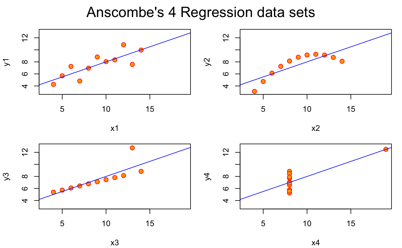
par(op)It’s nice to see some fun style in the comments!
But what we learn here is that the data itself has similar statistical properties, in terms of summary statistics, but also in terms of regression fit.
So, you might look at those and think what you’ve learned is: “Everything looks the same”.
But the point is that when we visualise the data, we learn:
Everything is actually very different.
And that the only way to learn this is through data visualisation!
Exploring Anscombe using the tidyverse
The helpfile does a great job of providing summaries of the data and plots!
There have been some recent changes with dplyr 1.0.0 coming out just the other day. I think it would be interesting to try doing the same steps as in the helpfile, but using the tidyverse tools.
There are a few key parts to this analysis:
- Tidy up the data
- Explore the summary statistics of each group
- Fit a model to each group
- Make the plots in ggplot2.
Tidy up the data
Before we tidy up the data, it is good to think about what format we want the data in.
Currently, the data is in this format:
head(anscombe)
#>   x1 x2 x3 x4   y1   y2    y3   y4
#> 1 10 10 10  8 8.04 9.14  7.46 6.58
#> 2  8  8  8  8 6.95 8.14  6.77 5.76
#> 3 13 13 13  8 7.58 8.74 12.74 7.71
#> 4  9  9  9  8 8.81 8.77  7.11 8.84
#> 5 11 11 11  8 8.33 9.26  7.81 8.47
#> 6 14 14 14  8 9.96 8.10  8.84 7.04
So how do we know the “right” format?
One trick that I use is to imagine how I would write the ggplot code. Because this then allows me to work out what I want the columns to be.
So, perhaps at a basic level, I’d want code like this:
ggplot(anscombe,
       aes(x = x,
           y = y)) +
  geom_point() +
  facet_wrap(~set)
So this tells me:
- The x axis maps onto the x column
- The y axis maps onto the y column
- I have a column, set
What we want is a format where we have:
| set | x | y |
|---|---|---|
| 1 | 10 | 8.04 |
In fact, reading the recent documentation for tidyr's pivot_longer (the new version of gather), we have new example that shows you how to clean the anscombe data:
library(tidyverse)
#> -- Attaching packages ----------------------------- tidyverse 1.3.0 --
#> v ggplot2 3.3.1     v purrr   0.3.4
#> v tibble  3.0.1     v dplyr   1.0.0
#> v tidyr   1.1.0     v stringr 1.4.0
#> v readr   1.3.1     v forcats 0.5.0
#> -- Conflicts -------------------------------- tidyverse_conflicts() --
#> x dplyr::filter() masks stats::filter()
#> x dplyr::lag()    masks stats::lag()

tidy_anscombe <- anscombe %>%
 pivot_longer(cols = everything(),
              names_to = c(".value", "set"),
              names_pattern = "(.)(.)")

tidy_anscombe
#> # A tibble: 44 x 3
#>    set       x     y
#>    <chr> <dbl> <dbl>
#>  1 1        10  8.04
#>  2 2        10  9.14
#>  3 3        10  7.46
#>  4 4         8  6.58
#>  5 1         8  6.95
#>  6 2         8  8.14
#>  7 3         8  6.77
#>  8 4         8  5.76
#>  9 1        13  7.58
#> 10 2        13  8.74
#> # ... with 34 more rows
So, what happened there? Let’s break it down.
cols = everything()
We pivot the data into a longer format, selecting every column with:
names_to = c(".value", "set")
We specify how we want to create the new names of the data with:
Now this includes a nice bit of magic here, the “.value” command indicates a component of the name is also in the value. What does that mean? Well we go from:
| x1 | x2 | y1 | y2 |
|---|---|---|---|
| 10 | 10 | 8.04 | 9.14 |
| 8 | 8 | 6.95 | 8.14 |
to
| set | x | y |
|---|---|---|
| 1 | 10 | 8.04 |
| 1 | 8 | 6.95 |
| 2 | 10 | 9.14 |
| 2 | 8 | 8.14 |
Because the names x1 and y1 are tied to both the “names” that we want to create (“x” and “y”), and the values we want create (set - 1…4). We are actually doing two steps here:
- Splitting up the variables “x1” into “x” and
- A value “1” in the variable in “set”.
So, the:
names_to = c(".value", "set")
Tells us there is something special about the current names, but now we need a way to specify how to break up the names. We need to split up the variables, “x1, x2, … y3, y4”, and we need to describe how to do that using names_pattern:
names_pattern = "(.)(.)"
The names and values are separated by two characters
I don’t speak regex good, so I looked it up on “regexr”, and basically this translates to “two characters”, so it will create a column for each character. You could equivalently write:
names_pattern = "([a-z])([1-9])"
Which would more explicitly say: "The first thing is a character, the second thing is a number.
This means that we end up with:
tidy_anscombe
#> # A tibble: 44 x 3
#>    set       x     y
#>    <chr> <dbl> <dbl>
#>  1 1        10  8.04
#>  2 2        10  9.14
#>  3 3        10  7.46
#>  4 4         8  6.58
#>  5 1         8  6.95
#>  6 2         8  8.14
#>  7 3         8  6.77
#>  8 4         8  5.76
#>  9 1        13  7.58
#> 10 2        13  8.74
#> # ... with 34 more rows
Also just to give you a sense of the improvement of pivot_longer / pivot_wider over gather / spread, this is how I previously wrote this example (this blog post was started on 2017-12-08 and published on 2020-06-01) - and it didn’t actually quite work and I gave up. (Although David Robinsons’s post on tidyverse plotting of Anscombe’s quartet could have helped in retrospect).
old_tidy_anscombe <- anscombe %>%
  gather(key = "variable",
         value = "value") %>%
  as_tibble() %>%
  # So now we need to split this out into groups based on the number.
  mutate(group = readr::parse_number(variable),
         variable = stringr::str_remove(variable, "[1-9]")) %>%
  select(variable,
         group,
         value) %>%
  # And then we actually want to spread out the variable column
  rowid_to_column() %>%
  spread(key = variable,
         value = value)

old_tidy_anscombe
#> # A tibble: 88 x 4
#>    rowid group     x     y
#>    <int> <dbl> <dbl> <dbl>
#>  1     1     1    10    NA
#>  2     2     1     8    NA
#>  3     3     1    13    NA
#>  4     4     1     9    NA
#>  5     5     1    11    NA
#>  6     6     1    14    NA
#>  7     7     1     6    NA
#>  8     8     1     4    NA
#>  9     9     1    12    NA
#> 10    10     1     7    NA
#> # ... with 78 more rows
Explore the summary statistics of each group
So we want to be able to do:
summary(anscombe)
#>        x1             x2             x3             x4           y1
#>  Min.   : 4.0   Min.   : 4.0   Min.   : 4.0   Min.   : 8   Min.   : 4.260
#>  1st Qu.: 6.5   1st Qu.: 6.5   1st Qu.: 6.5   1st Qu.: 8   1st Qu.: 6.315
#>  Median : 9.0   Median : 9.0   Median : 9.0   Median : 8   Median : 7.580
#>  Mean   : 9.0   Mean   : 9.0   Mean   : 9.0   Mean   : 9   Mean   : 7.501
#>  3rd Qu.:11.5   3rd Qu.:11.5   3rd Qu.:11.5   3rd Qu.: 8   3rd Qu.: 8.570
#>  Max.   :14.0   Max.   :14.0   Max.   :14.0   Max.   :19   Max.   :10.840
#>        y2              y3              y4
#>  Min.   :3.100   Min.   : 5.39   Min.   : 5.250
#>  1st Qu.:6.695   1st Qu.: 6.25   1st Qu.: 6.170
#>  Median :8.140   Median : 7.11   Median : 7.040
#>  Mean   :7.501   Mean   : 7.50   Mean   : 7.501
#>  3rd Qu.:8.950   3rd Qu.: 7.98   3rd Qu.: 8.190
#>  Max.   :9.260   Max.   :12.74   Max.   :12.500
But in a tidyverse way?
We can take this opportunity to use some of the new features in dplyr 1.0.0, across and co, combined with tibble::lst() to give us nice column names:
library(dplyr)

tidy_anscombe_summary <- tidy_anscombe %>%
  group_by(set) %>%
  summarise(across(.cols = everything(),
                   .fns = lst(min,max,median,mean,sd,var),
                   .names = "{col}_{fn}"))
#> `summarise()` ungrouping output (override with `.groups` argument)

tidy_anscombe_summary
#> # A tibble: 4 x 13
#>   set   x_min x_max x_median x_mean  x_sd x_var y_min y_max y_median y_mean
#>   <chr> <dbl> <dbl>    <dbl>  <dbl> <dbl> <dbl> <dbl> <dbl>    <dbl>  <dbl>
#> 1 1         4    14        9      9  3.32    11  4.26 10.8      7.58   7.50
#> 2 2         4    14        9      9  3.32    11  3.1   9.26     8.14   7.50
#> 3 3         4    14        9      9  3.32    11  5.39 12.7      7.11   7.5
#> 4 4         8    19        8      9  3.32    11  5.25 12.5      7.04   7.50
#> # ... with 2 more variables: y_sd <dbl>, y_var <dbl>
Let’s break that down.
tidy_anscombe %>%
  group_by(set)
For each set
summarise(across(.cols = everything(),
Calculate a one row summary (per group), across every variable:
.fns = lst(min,max,median,mean,sd,var),
Apply these functions
(lst automatically names the functions after their input)
names(tibble::lst(max))
#> [1] "max"
.names = "{col}_{fn}"
Then produce column names that inherit the column name, then the function name (thanks to our friend
lst).
One more time, this is what we get:
tidy_anscombe_summary
#> # A tibble: 4 x 13
#>   set   x_min x_max x_median x_mean  x_sd x_var y_min y_max y_median y_mean
#>   <chr> <dbl> <dbl>    <dbl>  <dbl> <dbl> <dbl> <dbl> <dbl>    <dbl>  <dbl>
#> 1 1         4    14        9      9  3.32    11  4.26 10.8      7.58   7.50
#> 2 2         4    14        9      9  3.32    11  3.1   9.26     8.14   7.50
#> 3 3         4    14        9      9  3.32    11  5.39 12.7      7.11   7.5
#> 4 4         8    19        8      9  3.32    11  5.25 12.5      7.04   7.50
#> # ... with 2 more variables: y_sd <dbl>, y_var <dbl>
There’s no getting around the fact that summary(anscombe) is less work, in this instance. Like, it is actually amazing.
But, what you trade off there is the fact that you need data in an inherently inconvenient format for other parts of data analysis, and gain tools that allow you to express yourselve in a variety of circumstance well beyond summary can do.
I think this is pretty dang neat!
Fit a model to each group
This is a good one.
##-- now some "magic" to do the 4 regressions in a loop:
ff <- y ~ x
mods <- setNames(as.list(1:4), paste0("lm", 1:4))
for(i in 1:4) {
  ff[2:3] <- lapply(paste0(c("y","x"), i), as.name)
  mods[[i]] <- lmi <- lm(ff, data = anscombe)
  print(anova(lmi))
}
#> Analysis of Variance Table
#>
#> Response: y1
#>           Df Sum Sq Mean Sq F value  Pr(>F)
#> x1         1 27.510 27.5100   17.99 0.00217 **
#> Residuals  9 13.763  1.5292
#> ---
#> Signif. codes:  0 '***' 0.001 '**' 0.01 '*' 0.05 '.' 0.1 ' ' 1
#> Analysis of Variance Table
#>
#> Response: y2
#>           Df Sum Sq Mean Sq F value   Pr(>F)
#> x2         1 27.500 27.5000  17.966 0.002179 **
#> Residuals  9 13.776  1.5307
#> ---
#> Signif. codes:  0 '***' 0.001 '**' 0.01 '*' 0.05 '.' 0.1 ' ' 1
#> Analysis of Variance Table
#>
#> Response: y3
#>           Df Sum Sq Mean Sq F value   Pr(>F)
#> x3         1 27.470 27.4700  17.972 0.002176 **
#> Residuals  9 13.756  1.5285
#> ---
#> Signif. codes:  0 '***' 0.001 '**' 0.01 '*' 0.05 '.' 0.1 ' ' 1
#> Analysis of Variance Table
#>
#> Response: y4
#>           Df Sum Sq Mean Sq F value   Pr(>F)
#> x4         1 27.490 27.4900  18.003 0.002165 **
#> Residuals  9 13.742  1.5269
#> ---
#> Signif. codes:  0 '***' 0.001 '**' 0.01 '*' 0.05 '.' 0.1 ' ' 1

## See how close they are (numerically!)
sapply(mods, coef)
#>                   lm1      lm2       lm3       lm4
#> (Intercept) 3.0000909 3.000909 3.0024545 3.0017273
#> x1          0.5000909 0.500000 0.4997273 0.4999091
lapply(mods, function(fm) coef(summary(fm)))
#> $lm1
#>              Estimate Std. Error  t value    Pr(>|t|)
#> (Intercept) 3.0000909  1.1247468 2.667348 0.025734051
#> x1          0.5000909  0.1179055 4.241455 0.002169629
#>
#> $lm2
#>             Estimate Std. Error  t value    Pr(>|t|)
#> (Intercept) 3.000909  1.1253024 2.666758 0.025758941
#> x2          0.500000  0.1179637 4.238590 0.002178816
#>
#> $lm3
#>              Estimate Std. Error  t value    Pr(>|t|)
#> (Intercept) 3.0024545  1.1244812 2.670080 0.025619109
#> x3          0.4997273  0.1178777 4.239372 0.002176305
#>
#> $lm4
#>              Estimate Std. Error  t value    Pr(>|t|)
#> (Intercept) 3.0017273  1.1239211 2.670763 0.025590425
#> x4          0.4999091  0.1178189 4.243028 0.002164602
How to do this in tidyverse?
library(broom)

tidy_anscombe_models <- tidy_anscombe %>%
  group_nest(set) %>%
  mutate(fit = map(data, ~lm(y ~ x, data = .x)),
         tidy = map(fit, tidy),
         glance = map(fit, glance))
What this is doing is fitting a linear model to each of the groups in set, and then calculating summaries on the statistical model. Briefly:
group_nest(set)
Nest the data into groups based on set, which we can then do cool things with:
fit = map(data, ~lm(y ~ x, data = .x))
Fit a linear model to each of the datasets in
set
tidy = map(fit, tidy)
Tidy up each of the linear models in
setto get the coefficient information
glance = map(fit, glance))
Get the model fit statistics for each of the models.
Now, we unnest the tidy_anscombe_models:
tidy_anscombe_models %>%
  unnest(cols = c(tidy))
#> # A tibble: 8 x 9
#>   set          data fit    term   estimate std.error statistic p.value glance
#>   <chr> <list<tbl_> <list> <chr>     <dbl>     <dbl>     <dbl>   <dbl> <list>
#> 1 1        [11 x 2] <lm>   (Inte~    3.00      1.12       2.67 0.0257  <tibble ~
#> 2 1        [11 x 2] <lm>   x         0.500     0.118      4.24 0.00217 <tibble ~
#> 3 2        [11 x 2] <lm>   (Inte~    3.00      1.13       2.67 0.0258  <tibble ~
#> 4 2        [11 x 2] <lm>   x         0.5       0.118      4.24 0.00218 <tibble ~
#> 5 3        [11 x 2] <lm>   (Inte~    3.00      1.12       2.67 0.0256  <tibble ~
#> 6 3        [11 x 2] <lm>   x         0.500     0.118      4.24 0.00218 <tibble ~
#> 7 4        [11 x 2] <lm>   (Inte~    3.00      1.12       2.67 0.0256  <tibble ~
#> 8 4        [11 x 2] <lm>   x         0.500     0.118      4.24 0.00216 <tibble ~
But we’ll need to make the dataset wider with pivot_wider:
tidy_anscombe_models %>%
  unnest(cols = c(tidy)) %>%
  pivot_wider(id_cols = c(set,term),
              names_from = term,
              values_from = estimate)
#> # A tibble: 4 x 3
#>   set   `(Intercept)`     x
#>   <chr>         <dbl> <dbl>
#> 1 1              3.00 0.500
#> 2 2              3.00 0.5
#> 3 3              3.00 0.500
#> 4 4              3.00 0.500
Wow, so…the linear models give us basically the same information? Jeez.
But what do these
pivot_widerthings do?
I hear you cry?
Well, briefly:
id_cols = c(set,term)
Which columns give us unique rows that you want to make wider?
names_from = term
Which column contains the information we want to take names from?
values_from = estimate
Which column contains information we want to take the values from?
OK so maybe the model coefficients are bad, but surely some of the other model fit statistics help identify differences between the sets? Right?
tidy_anscombe_models %>%
  unnest(cols = c(glance)) %>%
  select(set, r.squared:df.residual)
#> # A tibble: 4 x 12
#>   set   r.squared adj.r.squared sigma statistic p.value    df logLik   AIC   BIC
#>   <chr>     <dbl>         <dbl> <dbl>     <dbl>   <dbl> <int>  <dbl> <dbl> <dbl>
#> 1 1         0.667         0.629  1.24      18.0 0.00217     2  -16.8  39.7  40.9
#> 2 2         0.666         0.629  1.24      18.0 0.00218     2  -16.8  39.7  40.9
#> 3 3         0.666         0.629  1.24      18.0 0.00218     2  -16.8  39.7  40.9
#> 4 4         0.667         0.630  1.24      18.0 0.00216     2  -16.8  39.7  40.9
#> # ... with 2 more variables: deviance <dbl>, df.residual <int>
Oh, dear. They’re all the same.
Make the plots in ggplot (which you should have done in the first place).
library(ggplot2)
ggplot(tidy_anscombe,
       aes(x = x,
           y = y)) +
  geom_point() +
  facet_wrap(~set) +
  geom_smooth(method = "lm", se = FALSE)
#> `geom_smooth()` using formula 'y ~ x'
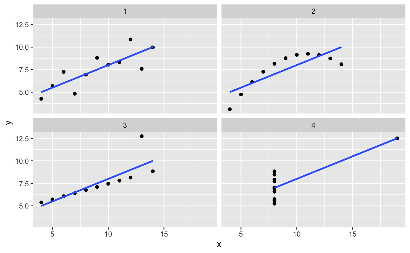
Yeah wow, the data really is quite different. Should have done that first!
Some thoughts
In writing this I noticed that, well, this is actually pretty dang hard. It covers a large chunk of skills you need to do a data analysis:
- Tidy up data
- Explore summary statistics
- Fit a (or many!) model(s)
- Make some plots.
It certainly packs a punch, for such a small dataset.
The state of the tools
I think it’s easy to look at the base R code in the helpfile for ?anscombe and say “oh, there’s better ways to write that code now!”.
Well, sure, there might be. But I can’t help but think there are always going to be better ways to write the code. I’m certain that there are better ways to write the code I created for this blog post.
But that’s kind of not the point, the point is to demonstrate how to explore a dataset. The authors of the helpfile provided that for us. And if I wanted to explore the data myself without that helpfile, it would have actually been harder.
Let’s reflect on this for a moment. R include the anscombe dataset in it’s base (well, datasets) distribution, and not only that, in the help file, provide code that replicates the summary statistics and graphics presented by Anscombe in 1973.
We absolutely get the point of the summaries and the graphics.
And I think that is something to celebrate, I’m not sure who wrote that help file, but I think that was very kind of them.
Further reading
Check out Rasmus Bååth’s post on fitting a Bayesian spike-slab model to accurately fit to anscombe’s quartet. Cool stuff!
David Robinsons’s RPubs on tidyverse plotting of Anscombe’s quartet. I wish I read this back in 2017.