 Credibly
Curious
Credibly
Curious
Nick Tierney's (mostly) rstats blog
Explore longitudinal data with brolgar
Let’s say we’ve managed to find an interesting dataset 1 on heights for given countries since 1550 (yup!):
| country | year | height_cm | continent |
|---|---|---|---|
| Afghanistan | 1870 | 168.40 | Asia |
| Afghanistan | 1880 | 165.69 | Asia |
| Afghanistan | 1930 | 166.80 | Asia |
| Afghanistan | 1990 | 167.10 | Asia |
| Afghanistan | 2000 | 161.40 | Asia |
| Albania | 1880 | 170.10 | Europe |
We’ve got country, year, height (in centimetres), and continent. Neat!
Now, let’s look at it over time.
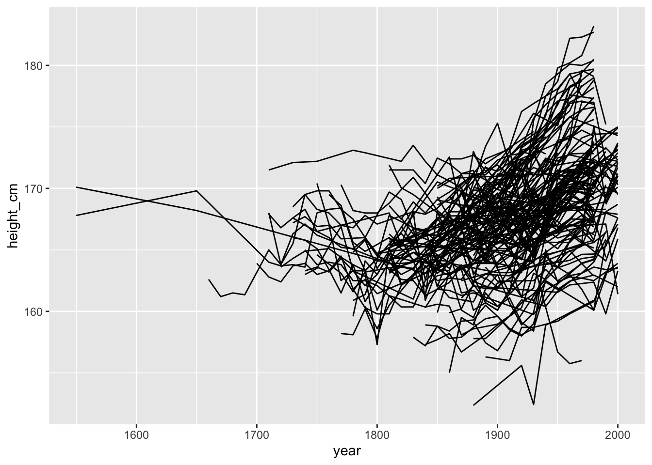
Oh no. What is even happening here?
This might seem familiar to you. Looking at longitudinal (panel) data often yields these kinds of “spaghetti” plots. These can be frustrating to deal with, as it is not clear how to see the right features in the data. Or even how to see some of your data.
I’ve spent a fair bit of time this year with Di Cook and also Tania Prvan thinking about some ways to improve how we look at and explore longitudinal data. It is a hard problem, and I’m certainly not done yet, but we created the brolgar package to make it easier to explore and visualise longitudinal data.
Why the name brolgar? It is an acronym, standing for:
- browse
- over
- longitudinal
- data
- graphically and
- analytically in
- R
It is so named after the “brolga”, a beautiful, gregarious (yes, gregarious!) native Australian crane:

By Felix Andrews (Floybix) - Own work, CC BY-SA 3.0, Link
Similar to our work on missing data with the naniar package, we wanted brolgar to work well with existing packages in the tidyverse, with particular focus on dplyr and ggplot2.
I’ll direct you to the official brolgar website for more details on the package, but here I will showcase three ideas that I think make workflow significantly more efficient, and help you learn from your data.
- Idea 1: Longitudinal data is a (non-typical) time series
- Idea 2: An opportunity to explore individuals, with various tools, and maintain information about the whole. We are more than our average.
- Idea 3: Quantify features of interest, and link to original series
Idea 1: Longitudinal data is (non-typical) a time series
Not your typical time series - it generally has irregular amounts of time between measurements, and contains multiple time series. There are typically many individuals or measurements relating back to one identifying feature.
So, to efficiently look at your longitudinal data, we assume it is a time series, with irregular time periods between measurements.
This might seem strange, (that’s OK!). There are two important things to remember:
- The key variable in your data is the identifier of your individuals or series.
- The index variable is the time component of your data.
Together, the index and key uniquely identify an observation.
The term key is used a lot in brolgar, so it is an important idea to internalise:
The key is the identifier of your individuals or series
So in the heights data, we have the following setup:
heights <- as_tsibble(x = heights,
                      key = countries,
                      index = year,
                      regular = FALSE)
Here as_tsibble() takes heights, and a key (countries), and index (year), and we state the regular = FALSE (since there are not regular time periods between measurements).
This creates a tsibble object - a powerful data abstraction for time series data, made available in the tsibble package by Earo Wang:
heights## # A tsibble: 1,499 x 4 [!]
## # Key: country [153]
## country year height_cm continent
## <chr> <dbl> <dbl> <chr>
## 1 Afghanistan 1870 168. Asia
## 2 Afghanistan 1880 166. Asia
## 3 Afghanistan 1930 167. Asia
## 4 Afghanistan 1990 167. Asia
## 5 Afghanistan 2000 161. Asia
## 6 Albania 1880 170. Europe
## 7 Albania 1890 170. Europe
## 8 Albania 1900 169. Europe
## 9 Albania 2000 168. Europe
## 10 Algeria 1910 169. Africa
## # … with 1,489 more rowsOnce we consider our longitudinal data a time series, we gain access to a set of amazing tools from the tidyverts team. What this means is that now that we know what your time index is, and what represents each series with a key, we can use that information to make sure we respect the structure in the data. This means you can spend more time performing analysis, and using functions fluently, and less time remembering to tell R about the structure of your data.
Currently brolgar only works with tsibble objects, but in the future we may look into extending this to work with regular data.frames.
If you want to learn more about what longitudinal data as a time series, you can read more in the vignette, “Longitudinal Data Structures”. And if you would like to learn more about tsibble, see the official package documentation or read the paper.
Idea 2: An opportunity to explore individuals, with various tools, and maintain information about the whole. We are more than our average.
To get a sense of what your data is, you can sometimes get something out of looking at a small sample. We’ve got some really neat tools for that.
Sample with sample_n_keys()
In dplyr, you can use sample_n() to sample n observations. Similarly, with brolgar, you can take a random sample of n keys using sample_n_keys(), or take a fraction (just as in dplyr::sample_frac()), using sample_frac_keys(), which samples a fraction of available keys.
So you could sample three keys like so:
# seed set for reproducibility
set.seed(2019-08-07)
sample_n_keys(heights, size = 3)
## # A tsibble: 21 x 4 [!]
## # Key: country [3]
## country year height_cm continent
## <chr> <dbl> <dbl> <chr>
## 1 Bangladesh 1850 162. Asia
## 2 Bangladesh 1860 162. Asia
## 3 Bangladesh 1870 164. Asia
## 4 Bangladesh 1880 162. Asia
## 5 Bangladesh 1950 162. Asia
## 6 Bangladesh 1960 162. Asia
## 7 Bangladesh 1980 162. Asia
## 8 Bangladesh 1990 160. Asia
## 9 Bangladesh 2000 163. Asia
## 10 Jamaica 1890 170. Americas
## # … with 11 more rowsAnd you can then create a plot with a similar process:
library(brolgar)
library(ggplot2)
# seed set for reproducibility
set.seed(2019-08-07)
heights %>%
  sample_n_keys(size = 10) %>%
  ggplot(aes(x = year,
             y = height_cm,
             group = country)) +
  geom_line()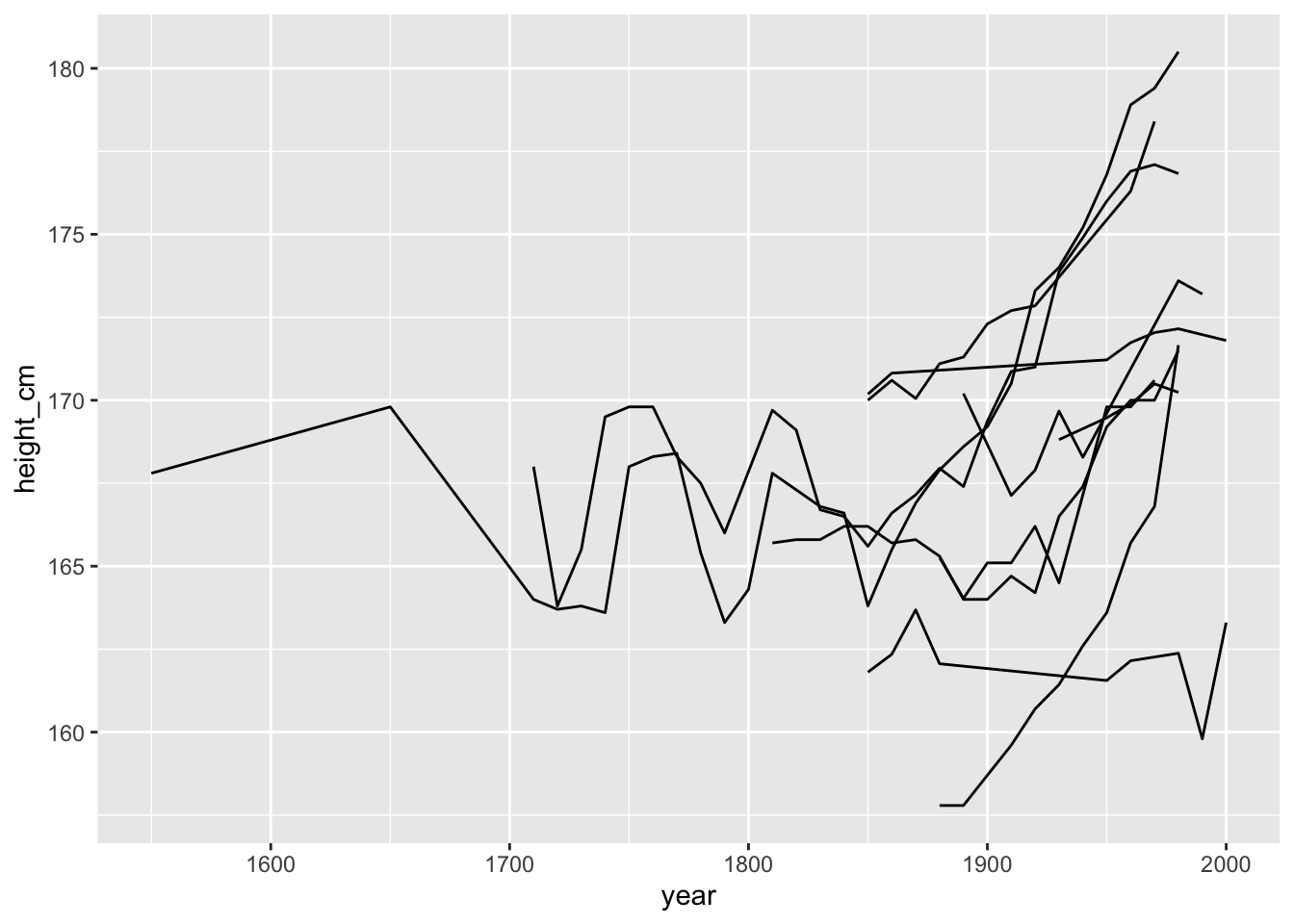
OK so now we can see that for this small sample, it looks like they heights are generally increasing over time, but there is some pretty massive fluctuation as well!
Filtering observations by number of observations
You can calculate the number of observations for each key with add_n_obs():
add_n_obs(heights)## # A tsibble: 1,499 x 5 [!]
## # Key: country [153]
## country year n_obs height_cm continent
## <chr> <dbl> <int> <dbl> <chr>
## 1 Afghanistan 1870 5 168. Asia
## 2 Afghanistan 1880 5 166. Asia
## 3 Afghanistan 1930 5 167. Asia
## 4 Afghanistan 1990 5 167. Asia
## 5 Afghanistan 2000 5 161. Asia
## 6 Albania 1880 4 170. Europe
## 7 Albania 1890 4 170. Europe
## 8 Albania 1900 4 169. Europe
## 9 Albania 2000 4 168. Europe
## 10 Algeria 1910 5 169. Africa
## # … with 1,489 more rowsThis means you can combine add_n_obs() and sample_n_keys() with filter() to filter keys with say, greater than 5 observations:
# set seed for reproducibility
set.seed(2019-08-07)
library(dplyr)
##
## Attaching package: 'dplyr'## The following objects are masked from 'package:stats':
##
## filter, lag## The following objects are masked from 'package:base':
##
## intersect, setdiff, setequal, unionheights %>%
add_n_obs() %>%
filter(n_obs > 5) %>%
sample_n_keys(size = 10) %>%
ggplot(aes(x = year,
y = height_cm,
group = country)) +
geom_line()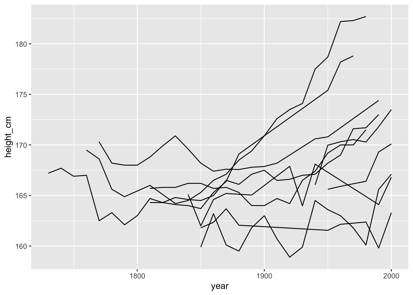
It looks like we have a bit of a mixed bag in terms of some countries increasing a lot over time, and others not so much.
Can we break these into many plots?
Sample with facet_sample()
facet_sample() allows you to plot many samples of your data. All you need to do is specify the number of keys per facet, and the number of facets with n_per_facet and n_facets. By default, it splits the data into 12 facets with 5 per facet:
# set seed for reproducibility
set.seed(2019-08-07)

ggplot(heights,
       aes(x = year,
           y = height_cm,
           group = country)) +
  geom_line() +
  facet_sample()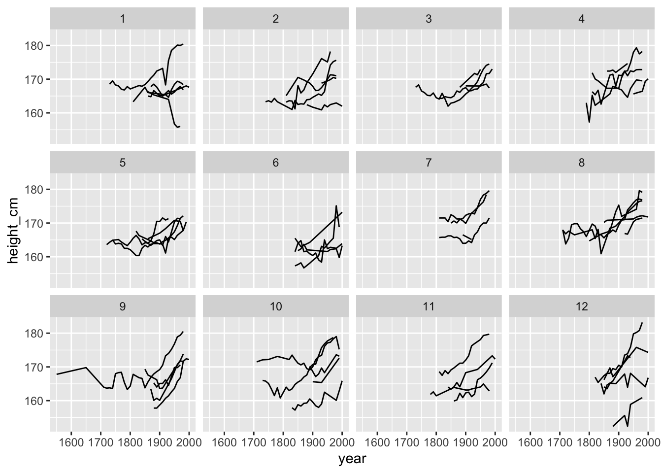
Interesting - looks again like many are increasing, but there is some variation and some serious wiggliness!
Idea 3: Quantify features of interest, and link to original series
In order to find features of interest, there are few steps.
- Quantify what is interesting
- Based on this feature of interest, reduce each series (
key) down to a one-row summary of features. - join this series back to the regular data.
Step 1. Quantify what is interesting
What is an interesting summary of your individuals? Is it the minimum value for each series? The maximum? Or maybe you want to know which countries are always increasing or decreasing?
Step 2. Reduce to one-row summary of features with features()
You can extract features() of longitudinal data using the features() function, from fabletools. We were interested in those countries that were always increasing or decreasing. This property is otherwise known as monotonicity, and can be calculated like so:
heights %>%
  features(height_cm, feat_monotonic)
## # A tibble: 153 x 5
## country increase decrease unvary monotonic
## <chr> <lgl> <lgl> <lgl> <lgl>
## 1 Afghanistan FALSE FALSE FALSE FALSE
## 2 Albania FALSE TRUE FALSE TRUE
## 3 Algeria FALSE FALSE FALSE FALSE
## 4 Angola FALSE FALSE FALSE FALSE
## 5 Argentina FALSE FALSE FALSE FALSE
## 6 Armenia FALSE FALSE FALSE FALSE
## 7 Australia FALSE FALSE FALSE FALSE
## 8 Austria FALSE FALSE FALSE FALSE
## 9 Azerbaijan FALSE FALSE FALSE FALSE
## 10 Bahrain TRUE FALSE FALSE TRUE
## # … with 143 more rowsHere we have indicators for whether a country is increasing, decreasing, unvarying (flat / uniform), or monotonic (either increasing or decreasing).
You can read more about creating your own features in the vignette finding features.
Step 3. Joining individuals back to the data
You can join these features back to the data with a left_join, like so:
library(dplyr)
heights_mono <- heights %>%
  features(height_cm, feat_monotonic) %>%
  left_join(heights, by = "country")

heights_mono
## # A tibble: 1,499 x 8
## country increase decrease unvary monotonic year height_cm continent
## <chr> <lgl> <lgl> <lgl> <lgl> <dbl> <dbl> <chr>
## 1 Afghanistan FALSE FALSE FALSE FALSE 1870 168. Asia
## 2 Afghanistan FALSE FALSE FALSE FALSE 1880 166. Asia
## 3 Afghanistan FALSE FALSE FALSE FALSE 1930 167. Asia
## 4 Afghanistan FALSE FALSE FALSE FALSE 1990 167. Asia
## 5 Afghanistan FALSE FALSE FALSE FALSE 2000 161. Asia
## 6 Albania FALSE TRUE FALSE TRUE 1880 170. Europe
## 7 Albania FALSE TRUE FALSE TRUE 1890 170. Europe
## 8 Albania FALSE TRUE FALSE TRUE 1900 169. Europe
## 9 Albania FALSE TRUE FALSE TRUE 2000 168. Europe
## 10 Algeria FALSE FALSE FALSE FALSE 1910 169. Africa
## # … with 1,489 more rowsYou can then plot them with the amazing gghighlight package by Hiroaki Yutani to highlight interesting parts of a plot.
For example, one that highlights only those keys that are increasing:
library(gghighlight)
ggplot(heights_mono,
       aes(x = year,
           y = height_cm,
             group = country)) +
  geom_line() +
  gghighlight(increase)
## Warning: You set use_group_by = TRUE, but grouped calculation failed.
## Falling back to ungrouped filter operation...## label_key: country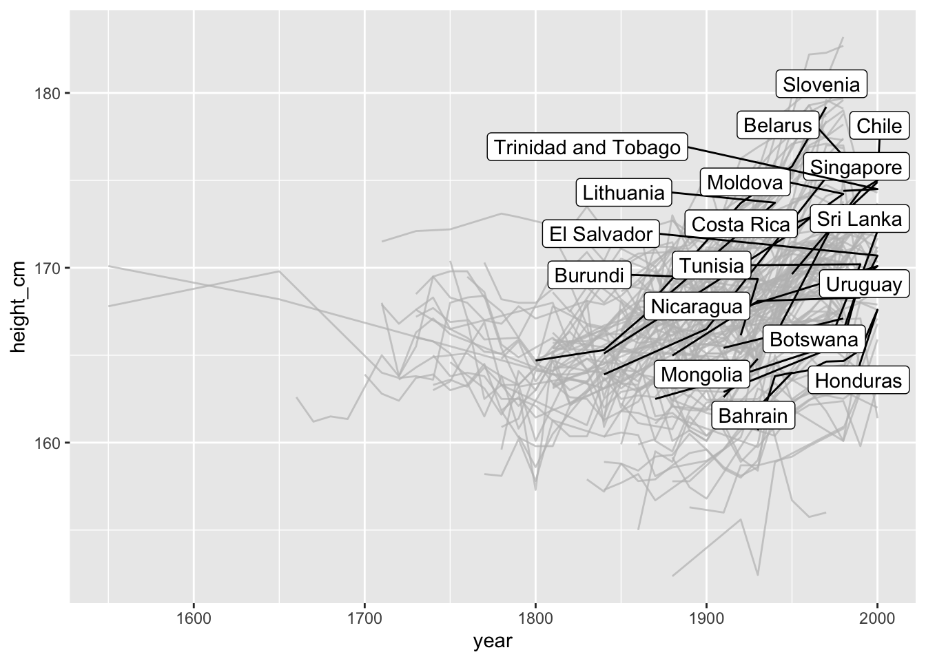
Fit a linear model for each key using key_slope()
key_slope() returns the intercept and slope estimate for each key, given some linear model formula. We can get the number of observations, and slope information for each key to identify those changing over time.
height_slope <- key_slope(heights, height_cm ~ year)

height_slope
## # A tibble: 153 x 3
## country .intercept .slope_year
## <chr> <dbl> <dbl>
## 1 Afghanistan 217. -0.0263
## 2 Albania 202. -0.0170
## 3 Algeria 111. 0.0297
## 4 Angola 43.9 0.0648
## 5 Argentina 147. 0.0117
## 6 Armenia 87.9 0.0419
## 7 Australia 46.1 0.0665
## 8 Austria 38.2 0.0695
## 9 Azerbaijan 150. 0.0111
## 10 Bahrain -157. 0.165
## # … with 143 more rowsThen join this back:
heights_slope <- heights %>%
  key_slope(height_cm ~ year) %>%
  left_join(heights, by = "country")

heights_slope
## # A tibble: 1,499 x 6
## country .intercept .slope_year year height_cm continent
## <chr> <dbl> <dbl> <dbl> <dbl> <chr>
## 1 Afghanistan 217. -0.0263 1870 168. Asia
## 2 Afghanistan 217. -0.0263 1880 166. Asia
## 3 Afghanistan 217. -0.0263 1930 167. Asia
## 4 Afghanistan 217. -0.0263 1990 167. Asia
## 5 Afghanistan 217. -0.0263 2000 161. Asia
## 6 Albania 202. -0.0170 1880 170. Europe
## 7 Albania 202. -0.0170 1890 170. Europe
## 8 Albania 202. -0.0170 1900 169. Europe
## 9 Albania 202. -0.0170 2000 168. Europe
## 10 Algeria 111. 0.0297 1910 169. Africa
## # … with 1,489 more rowsAnd highlight those with a negative slope:
ggplot(heights_slope,
       aes(x = year,
           y = height_cm,
           group = country)) +
  geom_line() +
  gghighlight(.slope_year < 0)
## Warning: You set use_group_by = TRUE, but grouped calculation failed.
## Falling back to ungrouped filter operation...## label_key: country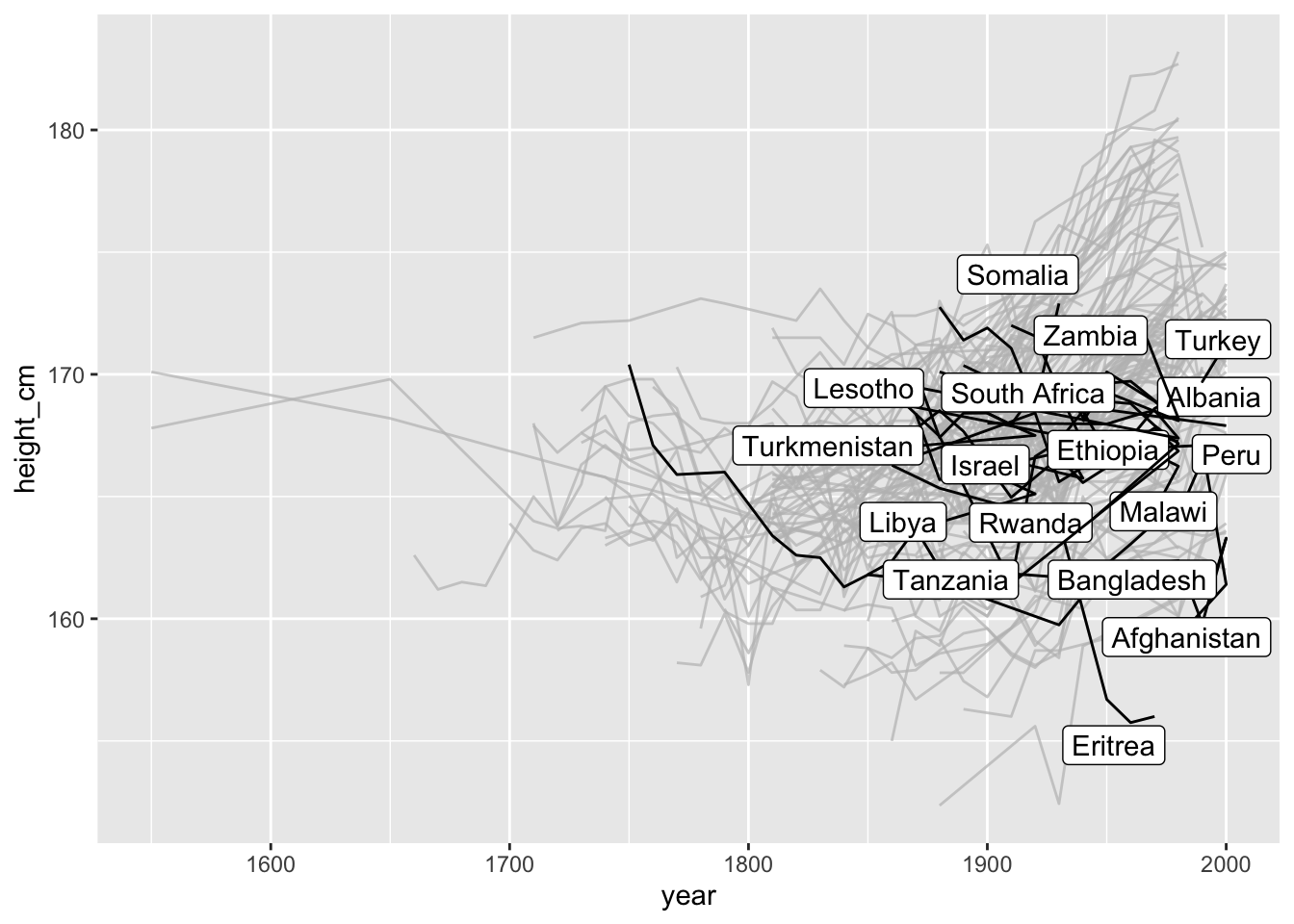
key_slope() is a somewhat experimental function which may change in the future - let me know what you think!
Facet along some feature:
You can even facet along some feature, using facet_strata(along = var). For example, we could facet our data along the slope. facet_strata requires a tsibble object, so we need to be careful with how we do our join.
gg_facet_along <- heights %>%
  key_slope(height_cm ~ year) %>%
  # careful how we do our join here
  left_join(x = heights,
            y = .,
            by = "country") %>%
ggplot(aes(x = year,
           y = height_cm,
           group = country)) +
  geom_line() +
  facet_strata(n_strata = 12,
               along = .slope_year)

gg_facet_along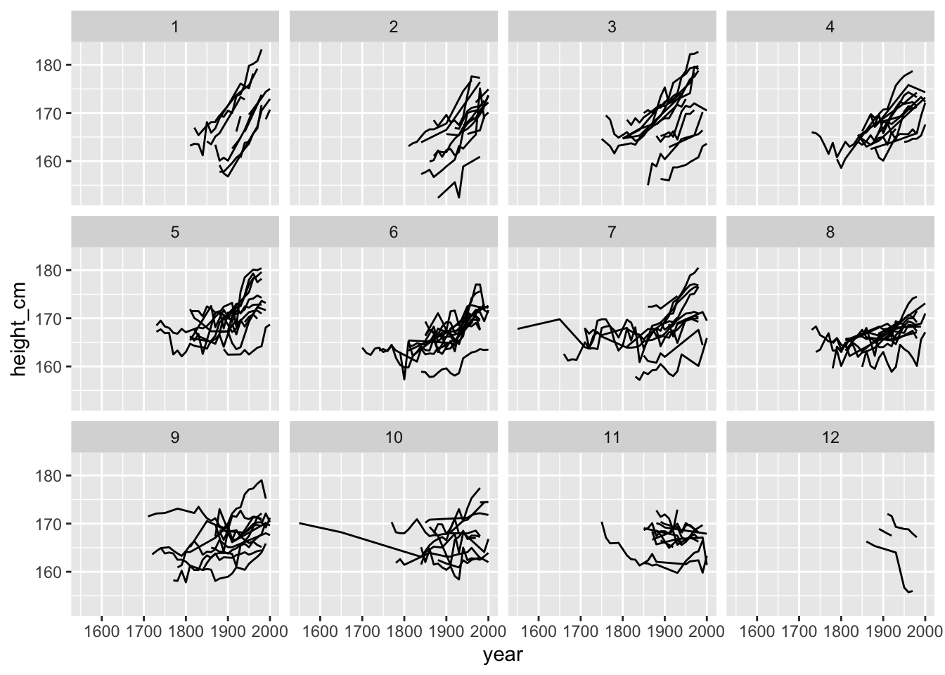
This shows us the spread of countries when we break slop up into 12 groups arranged in order from increasing to decreasing slope.
Under the hood, facet_strata() and facet_sample() are powered by sample_n_keys() and stratify_keys().
Find keys near some summary statistic with keys_near()
If you want to take the slope information and only return those individuals closest to the five number summary of slope - say those closest to these values:
summary(heights_slope$.slope_year)## Min. 1st Qu. Median Mean 3rd Qu. Max. NA's
## -0.10246 0.02187 0.03696 0.04175 0.06176 0.32150 9You can find those keys near the minimum, 1st quantile, median, mean, 3rd quantile maximum, using keys_near(), specifying the country and .slope_year.
heights_near <- heights %>%
  key_slope(height_cm ~ year) %>%
  keys_near(key = country,
            var = .slope_year)

heights_near
## # A tibble: 6 x 5
## # Groups: stat [5]
## country .slope_year stat stat_value stat_diff
## <chr> <dbl> <chr> <dbl> <dbl>
## 1 Eritrea -0.102 min -0.102 0
## 2 Tajikistan 0.0199 q25 0.0205 0.000632
## 3 Mali 0.0401 med 0.0403 0.000120
## 4 Spain 0.0404 med 0.0403 0.000120
## 5 Austria 0.0695 q_75 0.0690 0.000515
## 6 Burundi 0.321 max 0.321 0This returns those countries closest to the summary statistics of .slope_year. In this case we see that Eritrea has the greatest decline, and Burundi and Austra had the highest growth in height. Let’s include it in a plot with some nice sticky labels from the awesome stickylabeller package by James Goldie.
heights_near_join <- heights_near %>%
  left_join(heights, by = "country")

library(stickylabeller)
ggplot(heights_near_join,

       aes(x = year,
           y = height_cm,
           colour = country)) +
  geom_line() +
  facet_wrap(~stat + country,
             labeller = label_glue("Country: {country} \nNearest to the {stat} of the slope")) +
  theme_minimal() +
theme(legend.position = "none") 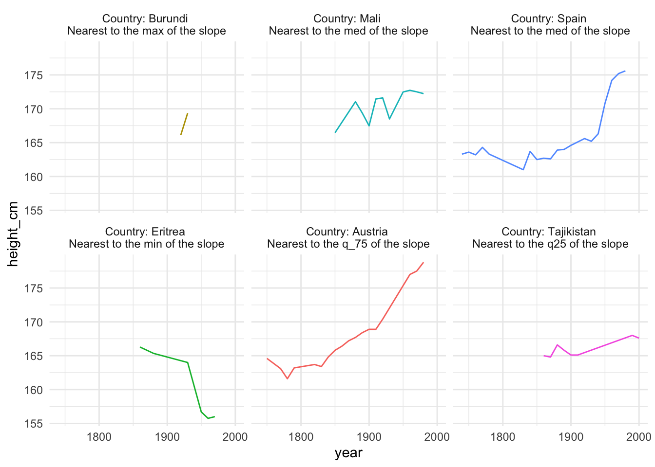
Interesting! It looks like “Burundi” had the highest increase in height over time, but only had a few obsercations, with Austria falling in second for the greatest increase in height over time.
You can read more about keys_near() at the Identifying interesting observations vignette. This is a somewhat experimental function which may change in the future - let me know what you think!
Fin
There is more to come for brolgar, and the API will likely undergo some changes as I get feedback from the community, and as I think and learn more about exploring longitudinal data. You can see my current thoughts on what to include in brolgar in the brolgar issues.
If you have any thoughts, comments, problems, or concerns, post a comment below or even better file an issue.
Happy data exploring!
Acknowledgements
Thank you to Mitchell O’Hara-Wild and Earo Wang for many useful discussions on the implementation of brolgar, as it was heavily inspired by the feasts package from the tidyverts. I would also like to thank Tania Prvan for her valuable early contributions to the project, as well as Stuart Lee for helpful discussions.
Footnotes
For more information, see the article: “Why are you tall while others are short? Agricultural production and other proximate determinants of global heights”, Joerg Baten and Matthias Blum, European Review of Economic History 18 (2014), 144–165. Data available from http://hdl.handle.net/10622/IAEKLA, accessed via the Clio Infra website.↩︎